The premier league restarts this weekend, I know I know, football bloody football am I right?
There’s a lot that is annoying about it, the media’s obsession so we can’t escape, the sheer amount of money in the English game is ungodly & the amount Man United make in a year could probably solve homelessness. The players aren’t even fun these days, they are all healthy & don’t even go for 10 pints after the game.
Worst of all despite every school in the land playing with the Rush Goalies rule it’s never been taken up in the professional game, not even once a year for a treat.
But despite all these flaws in the game some of us are excited about it and didn’t our lord and saviour Jesus say “if thee don’t like something ignore it and watch summath else”
I mean he probably did, he said a lot, loved the sound of his own voice that one.
Anyway, join Mike, Andy and Grax (three stylish and very sexy men), as we review the Premier League kits for the upcoming season.
So Before you settle down to the season and watch Match of the Day, or Match of the Day 2, which is like MOTD but there’s a Martin Keown in it, here’s a kit review that we have shit out of our brains onto your digital device of choice.
IMAGES FROM: https://www.premierleague.com/news/1701595
(MB: Michael Bell, AH: Andy Harland, GD: Grax Domain)
Arsenal

Home: (MB) I am an Arsenal fan so I’m going to be somewhat biased, however anything other than last year’s magnificence would be a downgrade and this is just that.
I don’t know what’s going on with the weird arrows, but I do like the slightly darker red.
The font we’re using for players’ names in the cups is appalling.
However it is growing on me every time I see it. So it’s a grower not a show’er which is something I can entirely relate to 5/10
(AH) Last year’s Arsenal effort was their best in tens of years, by far, could Adidas follow it up with another classic? Nearly, but no. Maybe the arrows are there to put the other team off, or perhaps just an issue with the printers. Who knows? At least it has white sleeves.
5/10
(MB) Of course, I hadn’t considered that, they are totally arrow heads as an attempt from Mikel Arteta to intimidate opponents. I raise my score by a point. 6/10
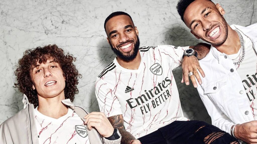
Away: (MB) Inspired by the Shaun of the Dead quote “you’ve got red on you” it’s a white shirt that has red on it. Clearly this was a crisp white shirt right until the end and the designers pen leaked & rather than admit the mistake they pretended it’s intentional.
Saying that & despite being blood splattered I like it
7/10.
(GD) I don’t care
Aston Villa
Most football sponsorships these days come from questionable means or betting sites so it’s nice to see that the humble musical instrument the Cazoo is sponsoring villa, long live the zoo.
Villa park is the closest ground to where me Mike lives & going into town on the train on a match day if you time your journey wrong & all the fans are on is a nightmare. Give them all a kazoo and I am fully on board.
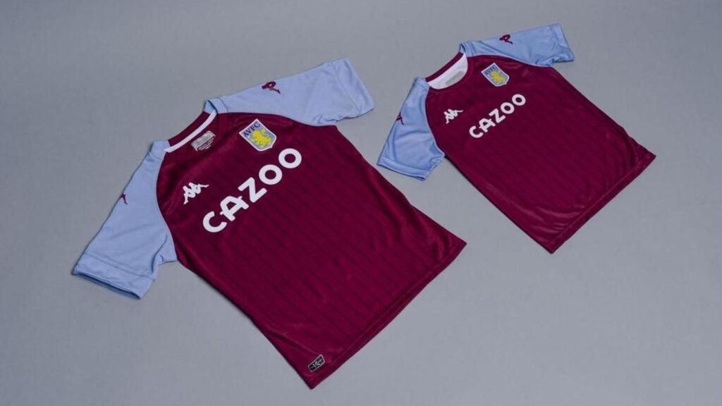
Home: (MB) Shirt wise it’s very simple but very effective, I like it alot.
Only negatives are vertical lines seem a bit pointless and don’t bring anything to the table. It’s a Kappa kit & I always like them as the logo looks like 2 bored girls sitting back to back but also ignoring each other which just amuses me, it’s like they’ve had an argument but both refuse to leave.
Nice & traditional shirt does the job.
8/10
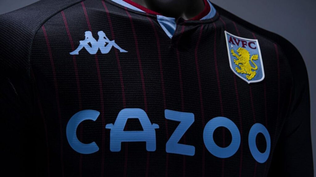
Away: (AH) Harks back to a classy Nike number from circa 2010 in colour and is in my humble opinion nicer than the home effort. However, the placement of the Kappa logo and club badge is higher than the international space station and that’s not good in the language of football shirts.
7/10
(GD) Seriously I’m not fussed.
Brighton
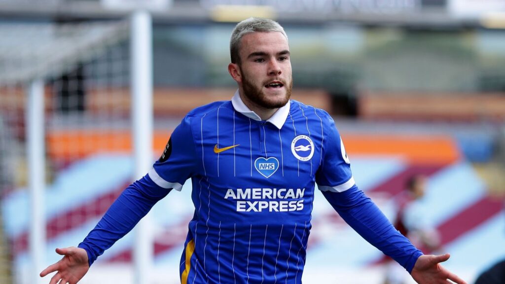
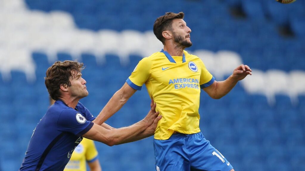
Home: (MB) The home kit looks like a football shirt your nan would buy you off the market when you were a kid because she doesn’t know the difference between the knock off market stall one and real shirt.
“I don’t know why he’s not wearing it, it’s a genuine Adddidas”
The collar is also shocking, It’s not very nice.
1/10
(AH) Also, this is a shirt dictated by the sponsor’s DEMANDS that they must have a plain behind to their logo, which basically ruins an already dreadful effort. BAD CREDIT CARD.
1/10
(GD) I mean you know I don’t like football, I’m not entirely sure why you asked me here.
Away: (AH) Yellow. It’s yellow. Which is fine, but then there’s THAT Nike collar. Genuinely gives me nightmares. Oh they signed Lallana on a free, yeah yeah, but in that kit after his recent success with Liverpool? My arse.
1/10
Burnley
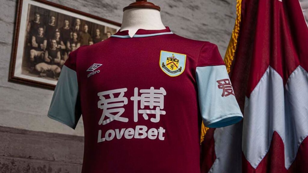
Home: (MB) The start of a trend where the sponsorship logos are too big & take up too much space on the otherwise meh but fine shirt. For that reason it gets a
3/10
(AH) Lovely collar, throwback to the past and some classic Umbro efforts of the early 90’s. That’s about it though. You shouldn’t be able to go wrong with these colours but the sponsor is HUGE and that is letting it down. Remember, when the fun stops, stop.
3/10
(GD) There’s only so many ways I can say I don’t care.
Chelsea
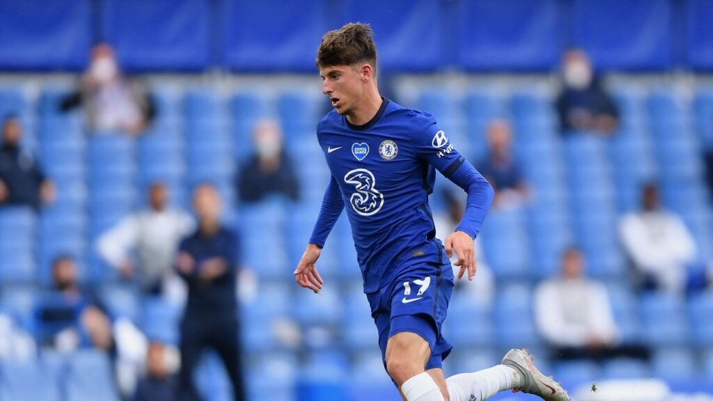
Home: (MB) Similar sponsor logo issues as Burnley, it’s simply too big and takes up a lot of real estate, it’s distracting & kind of ruins the fine shirt.
Which is a shame as this a really nice but ultra simple design plain dark blue doesn’t need a massive 3 in the middle.
4/10
(AH) This is the most coverage 3 Mobile has ever had in West London. Basic shirt with the decent new Nike side stripe offsetting the blue. It’s better than last years ‘child won a competition’ effort, but the sponsor is pretty lame. Bring back Amiga!
4/10
(GD) This one is Blue, how’s that for a review?
Away: (AH) It’s designed like the metal floor of a nasty nightclub. Minus the piss stains and other unidentifiable bodily fluids. No doubt that after a good session it will be sticky as anything. Puts the home shirt on a pedestal.
2/10
Crystal Palace
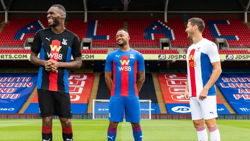
(MB) 3 kits, same design. There’s the traditional red & blue, white red & blue and in black.
The black away kit is a delight, but I’m a rubbish goth at heart so a black strip is always going to win points with me.
Home: (MB) The home kit is a nice twist on the usual red & blue stripes. Excellent effort Palace. Also I feel bad for them because their eagle mascot died over the summer and now they are eagleless.
7/10
(AH) So, the rumour has it that the crazy cats down at Selhurst park ‘borrowed’ the design from a kit concept kid. A pretty divisive design with the fans and although I’m a fan of a kit similar in design but with different colours, there’s something about it that’s not quite right., like slightly off milk. Also, note the exceptionally tight fit of this ‘Puma’ design (it’s actually another company’s effort, but don’t tell anyone our secret info). It’s average at best.
5/10
Away / Third: (AH)
Same as above, I do rate that away kit the highest though. 6/10 / 5/10. Mike thinks I should give extra points for their Eagle’s recent demise, but this lady shall not be turned.
(GD) Red makes you go faster, Red is also the colour of my face right now as I am growing increasingly angry at you two making me stay here and do something I give zero shits about.
Everton
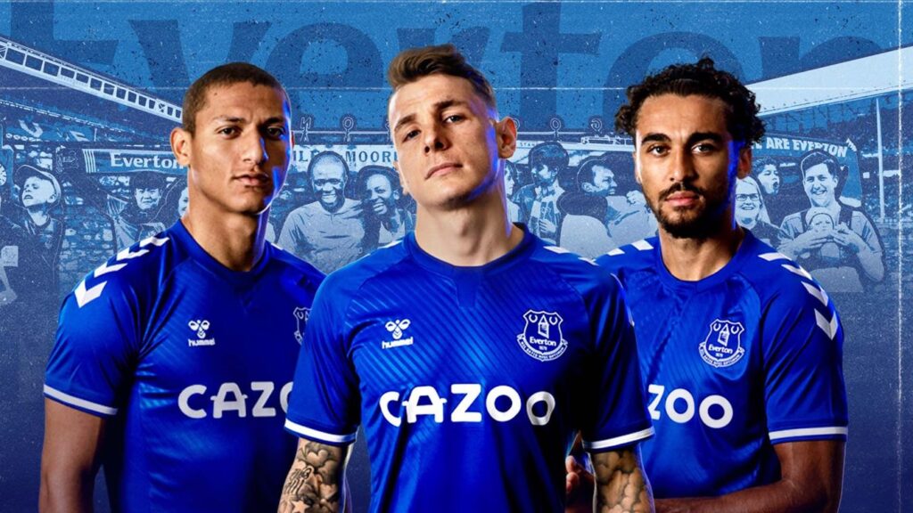
Home: (MB) Another Cazoo sponsor, I hope they give free ones away at the grounds. Most football songs are awfully repetitive, throw on some kazoos and it will really liven them up.
Really like this, the arrows down the shoulders feels very 80s. They haven’t faffed around with a collar, does the job, it’s very clear, retro/traditional yet stylish it’s just a very nice shirt.
8/10
(AH) HUMMEL! ALL HAIL OUR SWEET DANISH KIT OVERLORDS, I BOW TO YOU. Hummel has never made a bad football shirt. FACT, I WILL FIGHT YOU. I love it, I want it, but although I spent 2 years in the North West as a child, I couldn’t understand a word so I remained firmly attached to my Southampton roots. Ok, back to the shirt. BRILLIANT!
10/10
(GD) It’s another blue one, are they the same?
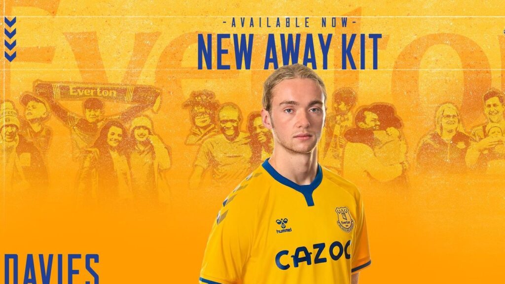
Away (AH) HUMMEL! (Maybe let down by the slightly funky collar) But it’s clean, crisp and Danish. What is there not to like? Cazoooooo!
9/10
Fulham
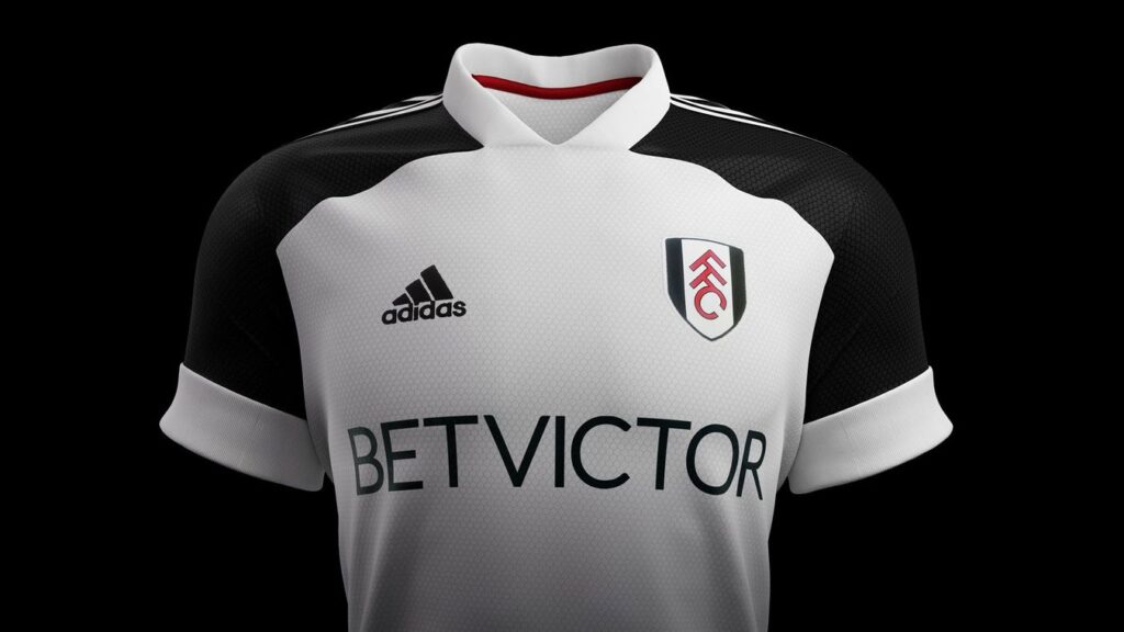
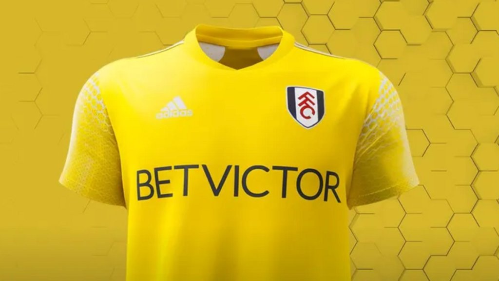
The cottagers, cheeky scamps – that sort of thing is the reason we’re in for a second wave. Fulham are a bit of a yoyo club these days but have usually had pretty simple, no fuss kits. This year is pretty textbook stuff for them.
Home: (AH) White. Black. Adidas. Fairly bog standard effort. Apparently it’s Aero Ready. I do hope it’s the mint one. (How are they still £1 for a large bar?).
6/10
(MB) I am really struggling for anything to say about this one. That is a note on the google doc we are using to write this so I come back later and finish it but it is also the entirety of my review. It’s white with black sleeves. Done
3/10
Away (AH) I usually like a yellow kit – (See above: Everton Away). But this is that iffy yellow that Newcastle used that year they had yellow and white stripes and we know what happened to them. No thanks Mr Adidas.
2/10
(GD) I went to Fulham once, bought some fudge
(AH) Do tell me more please Grax, I also like Fudge.
(GD) What’s to tell? Bought some fudge, popped it in my gob
(AH) Where did you get it from?
(GD) Fulham, I just said that, keep up
(AH) Leeds now.
Leeds
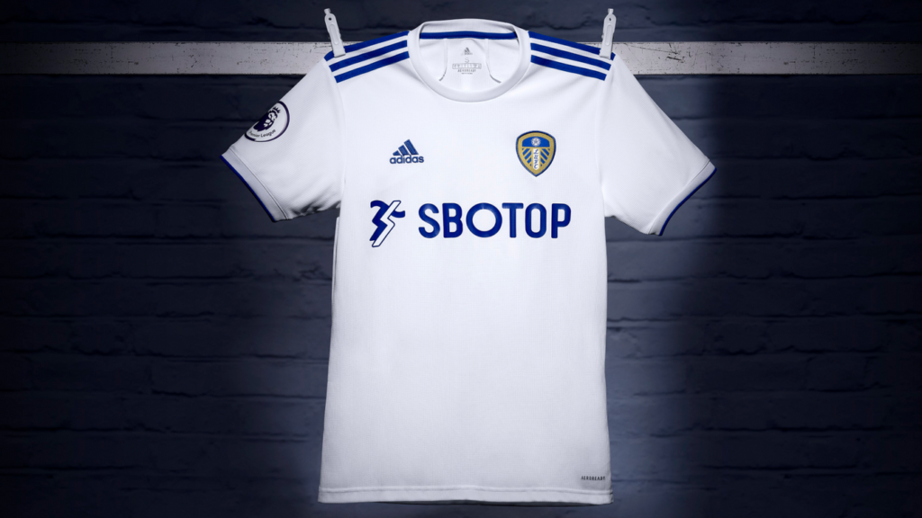
I’m really looking forward to seeing Leeds play this year. I started watching football properly in 1992 a season after they won the league so I’ve watched their decline in real time. It’s nice to have them back in the prem.
Home: (MB) The home kit as with all white kits I fear for the kit man/lady they’ve got a job on their hands keeping these looking fresh. Especially in the winter time with the muddy pitches. They’ll have to invest some of that promotion money on extra strong detergent, maybe do a cold pre wash soak, but that’s for them to decide (they are the professionals).
It’s a fine shirt but it’s just a white shirt with blue Adidas lines there’s not a lot to go on here.
4/10
(AH) YEBOAHHHHHHH! (That’s what I relate Leeds and the Premier League with). Clean kit, betting sponsor, but it’s not a horrific one, it’s clean and crisp and a good Adidas effort. (TAKE NOTE FULHAM AWAY).
6/10
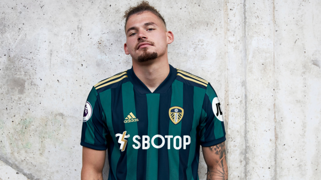
Away: (MB) The away kit is dead nice, the dark green and blue work really nicely and it’s a cracking little number
7/10
(AH) I really like this, with the exception of another iffy collar. But, that’s a great 90’s retro feel good kit and it will go far in the kit stakes.
8/10
Leicester
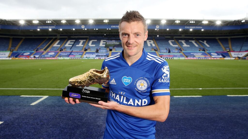
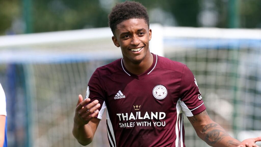
Home: (MB) I genuinely can’t tell any difference between this and last years effort.
Is it the same one? If so fair play, when I was growing up it was a new home shirt every 2 or 3 years, and away yearly.
If they’ve done that 10/10
If it’s just identical and charging the fans £60 for the same shirt 3/10
It’s a nice enough shirt but meh.
(GD) Another blue one?
(AH) I’d like to visit Thailand. But this is plain lazy by Mr Adidas. What bothers me most is the change of material in the upper chest which aligns with the iffy collar (that bloody Adidas collar again). It’s fine but it’s not innovative.
4/10
Away: (AH) I really like a maroon effort. AND FINALLY A GOOD ADIDAS COLLAR. It’s a sound football shirt. Really nice effort. Simple, not too snazzy, maybe a little different in colour scheme for the Foxes, but a classy one none the less.
8/10
Liverpool
Home: (MB) Champions of the league and champions of the home kits this year. It’s beautiful or as they say in the past a right bobby dazzler. Basically it’s a classic Liverpool kit, I really like the little white & green detailing in the collar & shelves. Let’s not piss about it’s a red Liverpool kit with some flashy touches sort of like how they play.
9/10 it’s a beauty.
(GD) I’m bored now and listening to Snow Patrol, real music
(MB) I have never respected you less
(GD) They had two objectively good albums
(MB) For early noughties indie standards maybe, but who is listening to them in 2020
(GD) i’m nearly 40
(MB) Yeah, fair enough, but get 6 music on, that’s a respectable station for someone of your vintage.
(AH) That new Doves album is out this weekend.
(MB) Not you as well!!!
*Disclaimer, other radio stations are available
(AH): Well done Nike, you came in just after the league winning season and took all that hard earned custom from NB. You’ve delivered what is arguably the best home kit of the season you sly fox.
10/10
Away: (MB) The away kit is like when you have some paint out and dip a paper kitchen towel into it & the paint gets soaked up, nasty thing. I work in an infant school, the nursery kids could have designed something better than this mess and they can’t even drive or tell the time or anything.
1/10
(AH) Awful. Was this the effort of the work experience kid? If so, make sure he or she never, ever returns to the business.
1/10
Man City
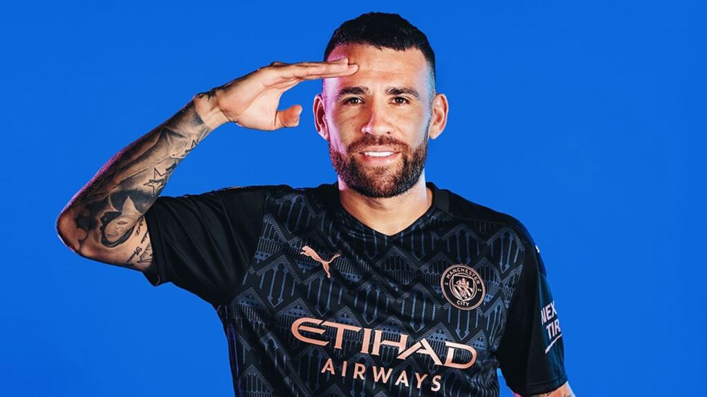
Home: (MB) Someone has drawn a maze in white pen on the light blue shirt. Alternatively it looks like shattered glass, will that mean they’ll have a shattered season?
Oh come on that is excellent, I’m reviewing shirts, and saying if I like them or not, that’s the best bit of journalism you’re going to get out of me.
The shirt is a no for me though
3/10
(AH) Erm, it’s like a cracked egg. I’m sure there’s some clever marketing chit chat a goo goo about this, but as it’s a plain back, it’s a big no no from me. Last season’s kit had purple sleeve things going on so this at least repairs that. It isn’t bad, but it’s not great.
4/10
(GD) Manchester Airport is the largest regional airport in the UK serving over 26 million passengers every year. I am researching facts about Manchester as it’s more interesting than this experience for me.
Away: (AH) They fell for the black and gold 2020 football shirt vibe… It’s the best of the three by far, but again, pretty average. Pep deserves better than this, careful Puma, you’ll have him leave soon if this doesn’t pick up.
5/10
Third: (MB) Right then, who stole your nans dollies? They’ve just traced one and thrown it on a kit. Rotten.
Pep is a stylish man, as a fellow bald man myself I respect his style choices, it’s only the 3rd kit, let him have a go at designing it.
1/10
(AH) Seriously, Pep will leave if you keep this up. Heed my warning Citizens, heed.
2/10
Man United
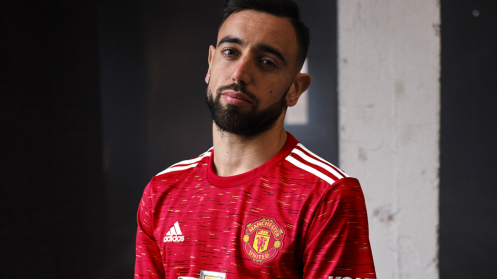
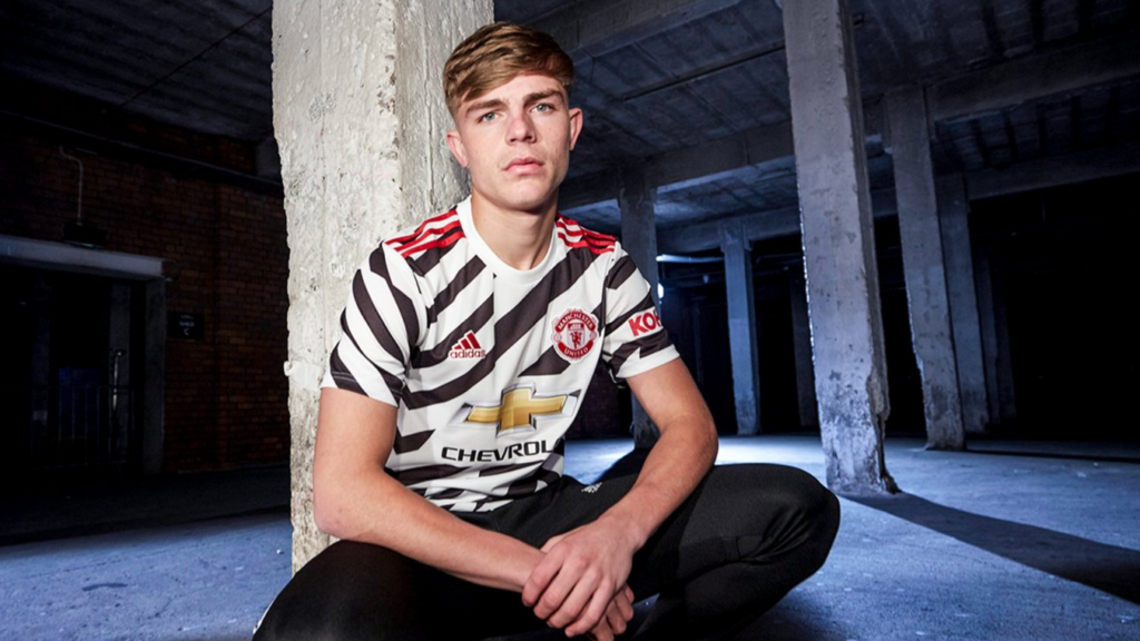
Home: (MB) This home kit looks like an old bus seat with the little yellow and black lines on the red, it’s hideous. The badge looks like it’s stuck on with Velcro as well. Or to quote what I said when I first saw it “the fuck is this bollocks about?” because in real life I am a sweary naughty man, who can’t be tamed…or maybe I can ladies, you should try.
Flirting over, This is a hideous shirt, so they’ll probably sign Sancho and Koulibaly now and win the league because the pictures in history will be them raising the title aloft in this horrible clobber.
1/10
(AH) Who hurt Manchester? Seriously. What is this? It makes City look good and I’ve scored their home effort as bang average. It is based on a bus seat. That is the only explanation. No thanks Mr Adidas. (Really bad year for you, C MINUS please try harder in 2021). P.S, Ladies, Mike is a genuine and loving man. (he’s a 7/10).
2/10
(GD) Manchester’s magnificent Town Hall shows a snake trying to eat its own tail on the ceiling of the main entrance. He’s called ‘Ouroboros’ and is an ancient pagan icon symbolising the eternal cycle of life. I know how he feels, this conversation feels like an eternal boring cycle. I don’t like football, i’ve made this very clear, why did you invite me here?
Away: (AH) Tis’ alright i guess. But a poor filling to a dreadful sandwich of shirts for the red devils in 2020.
3/10
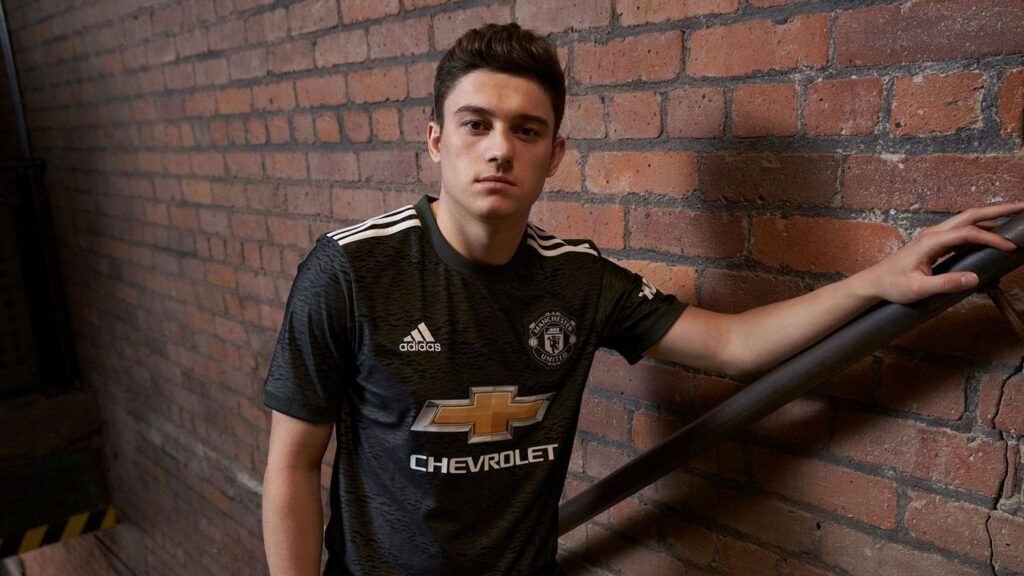
Third: (MB) Zebra shirt, I wouldn’t normally give a 3rd shirt any attention but it’s had a tone of online abuse. I like that they are trying to do something different I really do. Most kits are generic, but this is an awful attempt at whatever they were trying.
The zebra design is not nice and it’s just all over the place. I know leopard print is fashionable atm maybe that’s what they were going for but decided zebra was the next best thing, makes the home kit look acceptable. 0/10
(AH) Operation desert storm? Operation Dazzle the pants off of the opposition more like. WOW. NO. NO THANK YOU MR ADIDAS. Awful sponsor on this too compared to the away / home. The only 0/10 on the list? Probably.
0/10
(GD) Remember those 90’s popper adidas trousers? What was that about?
Newcastle
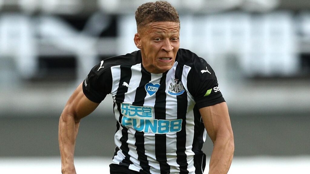
Home: (MB) Newcastle kits always look like Newcastle kits and this is a Newcastle kit. I have nothing negative to say about it though. My last big night out before the end of the world was in Newcastle after seeing Vic and Bob and I had a wonderful time so I really like the place.
I also had the finest pint of Guinness I’ve had in my life up there so fair play Newcastle you are great. The kit is a 6/10
6/10
(AH) FACTOID! Newcastle’s Puma logo is never black, thus their foes from Sunderland cannot claim a black cat adorns the Newcastle kit. Bad sponsor though, otherwise a decent Puma Newcastle kit. Imagine this with a proper Newcastle Brown Ale logo as sponsor. Now we’re talking!
6/10
(MB) Great fact, lovely bit of business.
(AH) Thanks Mike, I appreciate your support, have another point. 8/10
(GD) Newcastle is up north and cold, they should be playing in coats.
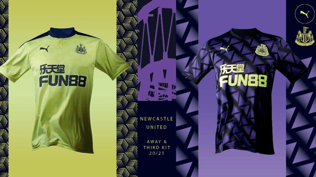
Away: (AH) It’s the bloody metal floor design again! Just in some odd greeny yellow. Why?
2/10
Third: (AH) No thanks. Puma are Adidas in disguise and don’t you know it, ugh. STOP BEING BAD AT FOOTBALL KITS.
1/10
Sheffield United
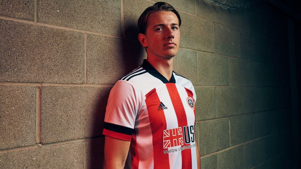
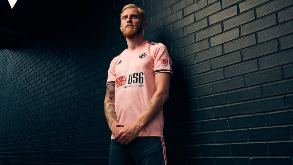
Home: (MB) Same as Newcastle, Sheffield United kits always look like Sheffield United kits. However this one is rather nice. They haven’t messed with the spacing of the stripes just 3 red stripes across, sometimes they try to fit like 6 and it gets a bit much. Nice kit but it’s like every kit they’ve ever had.
5/10
(AH) I’m a Southampton fan, so I know my red and white stripes. I also like Sheffield United and have had the luxury of playing at their ground. This is a little change to the usual offering with the white shoulder and the Adidas cuff thing going on. It’s pretty good. I shall not mention the largely white rear of the shirt though. Bad collar lets it down, but it’s not the worst.
6/10
(GD) I don’t care, I don’t care, I don’t care, I don’t care
Away: (AH) Put red and white shirts in the wash and you get: PINK. Pink shirts are sometimes pretty good (Everton have had some good ones recently) and this is actually decent. Is there not the need for a Third kit though somewhere down the line? Against Southampton away for example?
7/10
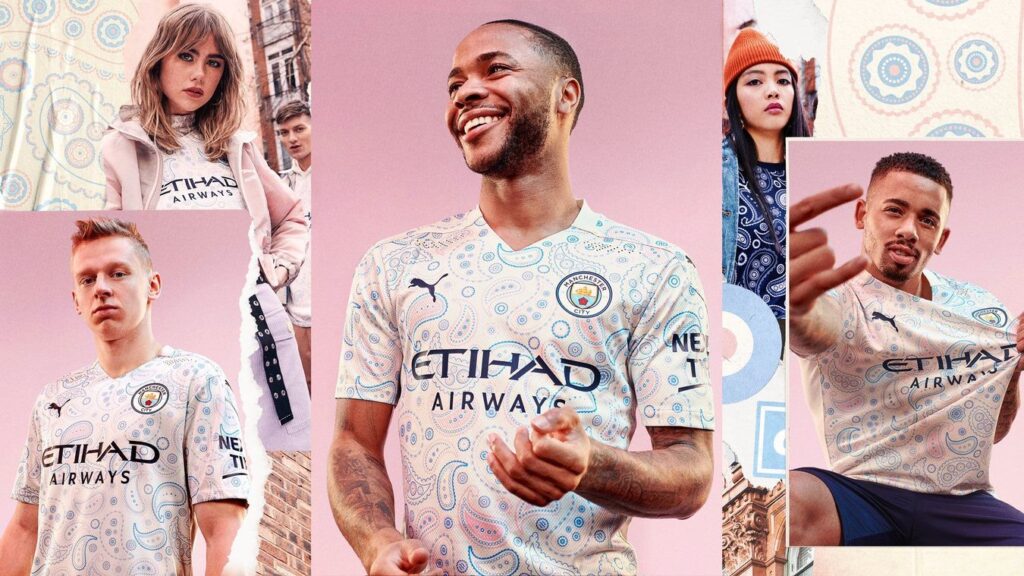
Southampton
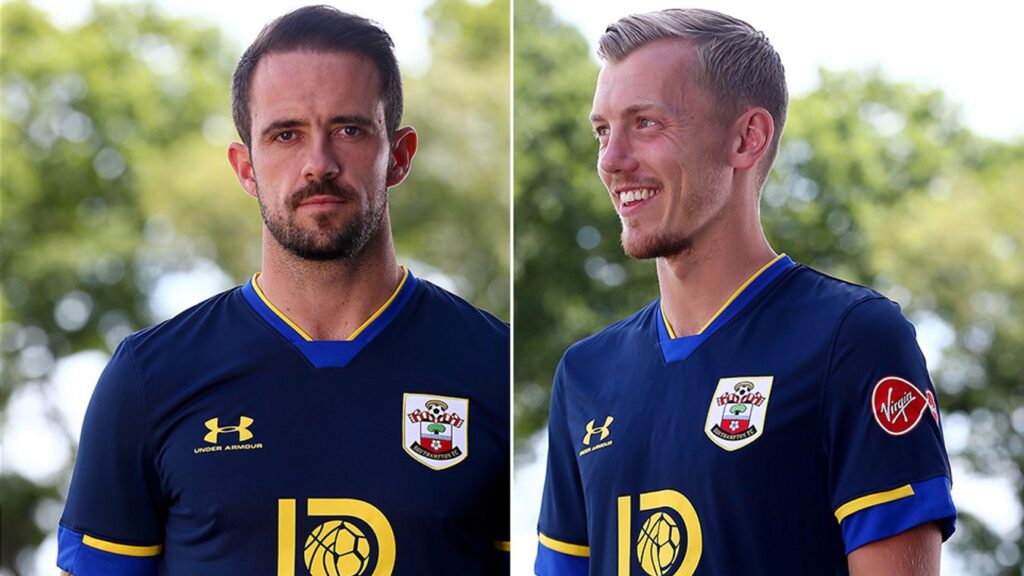
Home: (MB) River Plate were always the team I played on Master League on the Pro Evo 3-6 games because I liked the kits. This is River Plates home & away kit from that time span so I like it. Would have been a 10 but they’ve messed it around and the white with red slash in the 3rd kit annoyingly would have been my kit of the season. The red home is itill nice though.
8.25/10
But the white 3rd is a 10.
Oh that’s right I’m bringing fractions into the mix towards the end, weren’t expecting that now were you???
(AH) Ok, I’m going to admit this one at the top – this is my club. So therefore I must declare my bias. However, a celebration of 135 years is not a thing. 50, 100, 125, 150, 175, 200 yes.. But 135. No thanks Under Armour. Now, i’m also not a UA fan at all, they’ve literally given us one decent shirt in five years! Anyway, rant over. It’s fine. It’s clean and crisp and due to a massive financial cock up / very dodgy sponsor issue, the Saints now have a reasonable looking kit for 2020. (Also, after last season’s effort, this is 135x better).
6/10
(MB) Just admit it’s River Plate’s shirt and embrace it
(GD) You can’t put a river on a plate idiot, it’ll get wet
(AH) Do the dishes Grax, know your place
Away (AH) Blue is the colour of the enemy. But, not this hue. This is a very nice football shirt but once again 135 YEARS IS NOT A THING. The blue is in reference to the shorts of that first kit 135 years ago, so there’s a link. Which is fine. It’s better than the home.
7/10
Third (AH) YES PLEASE. Should have been the home kit to truly replicate the home kit from 135 years ago. But Umbro did that when we celebrated 125 years BECAUSE THAT’S A THING.
8/10
Tottenham
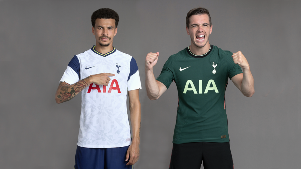
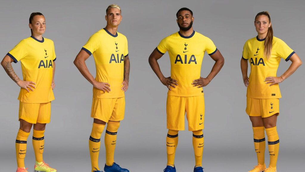
Home: (MB) Weird sleeves, half blue half white. Weird yellow on the collar and no yellow anywhere else on the strip. Strange pattern as well on the shirt itself, it’s like they’ve just gone to designers somewhere trendy and asked for one art please, then thrown down 20k cash in a big envelope for a scene in their new soap opera all or nothing, a season like no other was the tag line.
Well it’s a bit like all of your other seasons isn’t Tottenham? You finished somewhere between 4th and 10th and didn’t win anything. Some odd choices here.
3/10
(AH) Do not like it. If Nike kept with their template for 2020 then this could have been good (Chelsea for example). But it’s not. It’s very bad, file under ‘what are those stupid sleeve stripes doing?!?’
2/10
(GD) Tottenham starts with a T, that’s near the end of the alphabet, the end is nigh.
Away: (AH) Best of the three but it just looks like a traditional GK shirt.
4/10
Third: (MB) It’s too yellow, the team will look like a set of minions, which is how Jose appears to treat his players so quite fitting.
1/10
(AH) Spurs have a tradition of Yellow change kits (SEE HUMMEL 1989 – Ahh, I love Hummel). But this is pretty lairy. Not as bad a yellow as Fulham and I score points for the sponsor logo doing it’s best to suit the colour scheme. Looks odd with the centering, like the England Home kit just missing the stripe at the side.
3/10
West Brom
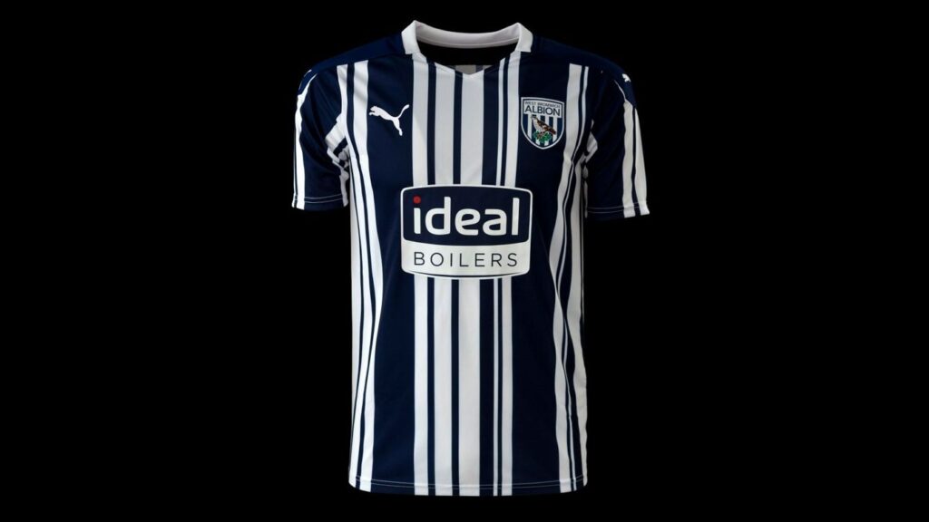
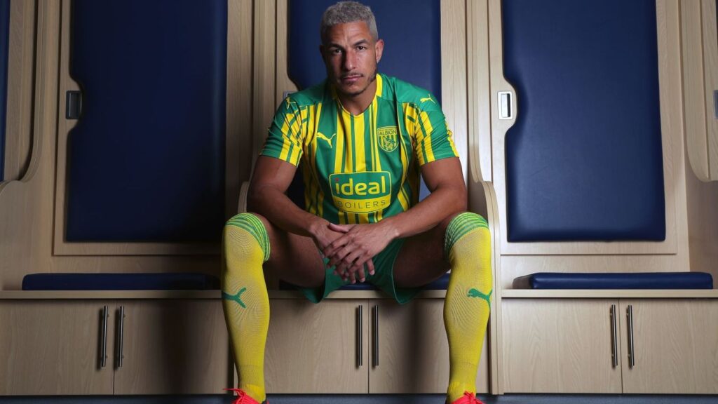
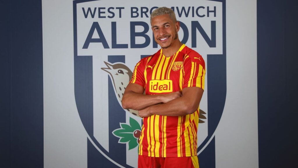
They’ve just inverted the colours on the same shirt. I think there was a button on MS Paint that did that, so we know how they’ve designed this year’s shirts. Same design different colours can work nicely (see Palace) but this doesn’t. Red and Yellow, seriously??
The mix of thick and thin stripes is awful.
There is too much going on. However I like that the sponsor is a boiler company, that feels quite old school
1/10
Home: (AH) Do you remember the ill fated Barcode Battler of the early 90’s? No? Well, I do. It took a half decent concept (handheld console gaming) and combined it with Barcodes. It failed rather spectacularly within minutes. This is sort of similar. Now i don’t mind the whole similarity with designs of home, away, third thing (See Crystal Palace) but it’s a little bit busy. However, it’s another throwback to a shirt of the early 90’s probably and that’s no bad thing. Too jazzy though.
4/10
Away and Third (AH) As above. Poor old Barcode Battler. The away is traditional, the third is Roy of the Rovers stuff.
4/10 / 4/10
(GD) I wish I had a Barcode Battler.
(AH) i’ll see if i can find you one on ebay
(GD) Really?
(AH) No, it was literally rubbish. However, there’s a mini disc player with your name on it though.
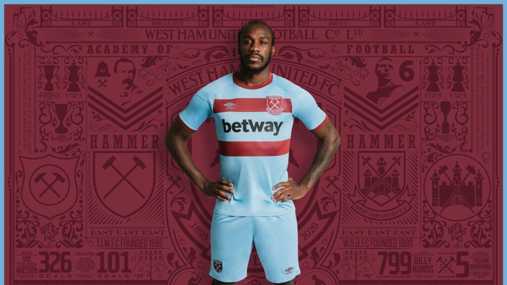
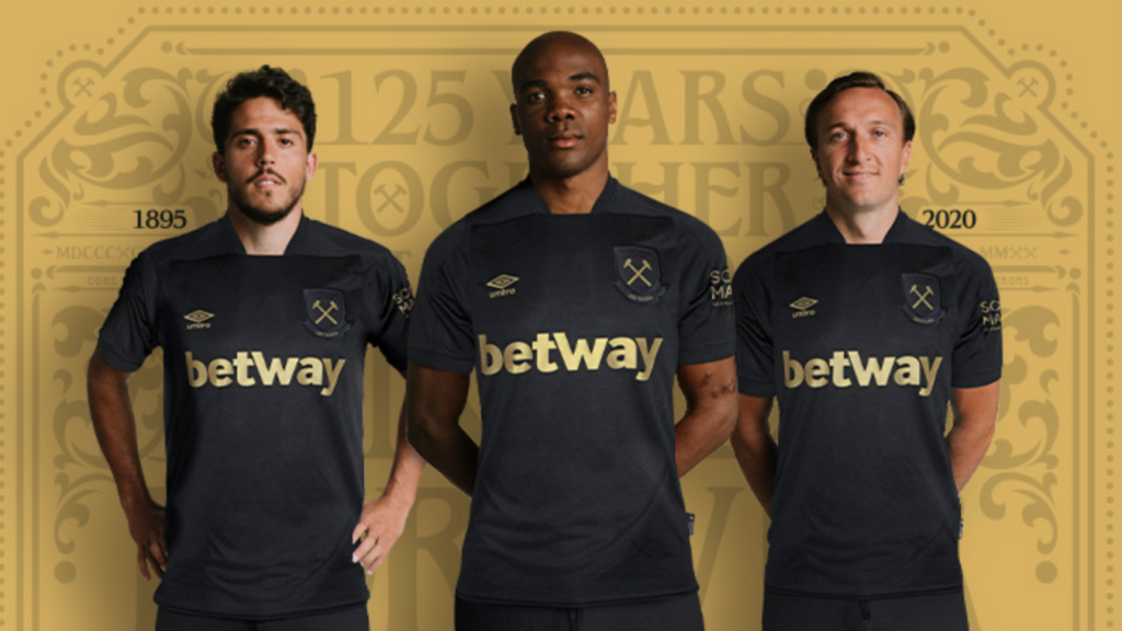
West Ham
Home: (MB) I actually like this, there is no messing about it’s claret and blue (electric boogaloo). Crisp design, no faff. Does everything it says on the tin. Shame they are definitely going down this season.
7/10
(AH) 125 YEARS! SEE SOUTHAMPTON, THIS IS A THING. If you screw up a West Ham home shirt then you’ve lost your right to make football shirts happen. I don’t like the sponsor, but it’s not a bad font. Also it’s not Bet365 which amuses me as Ray 365 Winstone is a hammer and he can’t wear this due to contractual obligations. Mug.
7/10
(GD) Is this nearly over?
Away: (AH) Another throwback to a traditional West Ham design also used in the 90’s as a throwback, back then too.
8/10
Third (AH) Black and Gold again anyone? Seems like a go to 2020 colour scheme. Slight issue with the collar but it’s clean and crisp and 125 YEARS.
7/10
Wolves
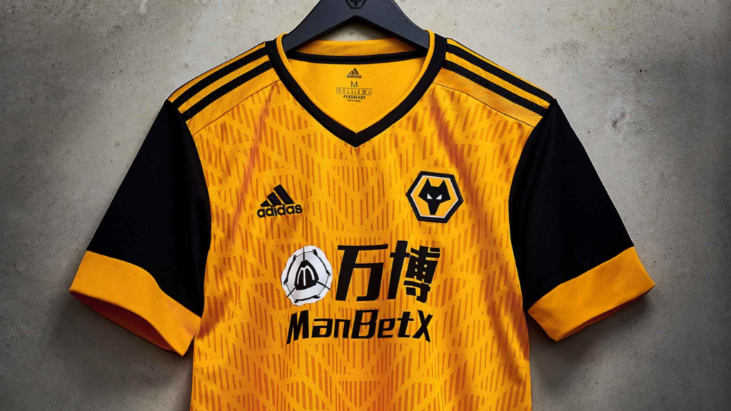
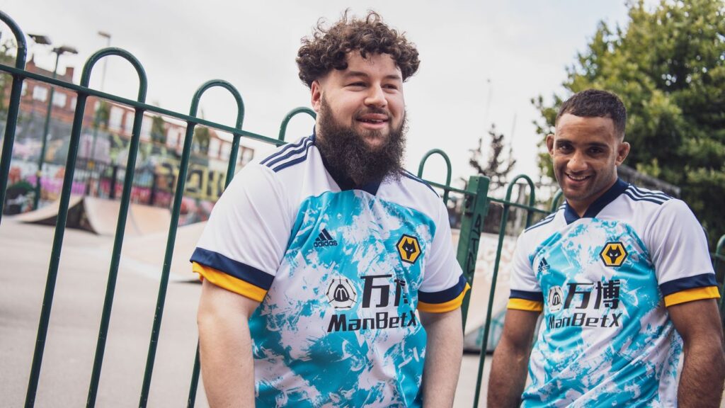
Home: (MB) Shouldn’t work but does. It’s got a messy arrow’y background design. The Gold/dark Orange colour shouldn’t look nice, in lesser hands this could easily be tacky, but this just all works really well together. Good sleeves and I just don’t know what to say other than it’s a really nice kit.
8/10
(AH) I like Wolves, I like their style and badge. They have a great heritage and fanbase, stadium and on the whole some good kits in the locker. This is a mixed bag. The design with the arrows draws the eye, which might be a decent distraction technique. But it also draws the eye to the ball bag region. I dunno, maybe Ruben Neves has a fine pair but I don’t want to think about that. Iffy sponsor which weirdly reminds me of McDonalds. However, I am very happy that Mr Adidas hasn’t messed about with the old gold.
7/10
Away: (MB) I take back all those nice things I just said.
This strip along with United’s zebra and City’s Doily has been in for a lot of abuse on twitter. Well everything gets abuse on twitter, but this has been getting extra abuse.
Is it justified?
I don’t think so, it’s not nice I conceded but they’ve tried something and it’s a miss. However it’s certainly not the worst kit this season.
The blue/white surfer vibe is interesting if nothing else. You definitely would have bought a shirt with that design on when you were 16 on your first holiday with friends in cornwall.
It reminds me of the 90s goalkeeper shirts where they just thought fuck it no one will buy it so doesn’t matter what it looks like, lets have some fun with it.
4/10
(AH) WTF MR ADIDAS? Ok, let’s break this one down. Snazzy design – ok, it’s different and that’s the point of an away shirt perhaps. But, if this was plain white, you would be onto a winner. The collar. No thanks. The plain white shoulder up, no thanks. The sleeve cuff, lovely. It’s not good, but thankfully for the Wolves, it’s not a City or United.
3/10
Conclusion: The best kit of the 2020/21 season has to be none of these but Loch Ness FC because it has a nessy on it.
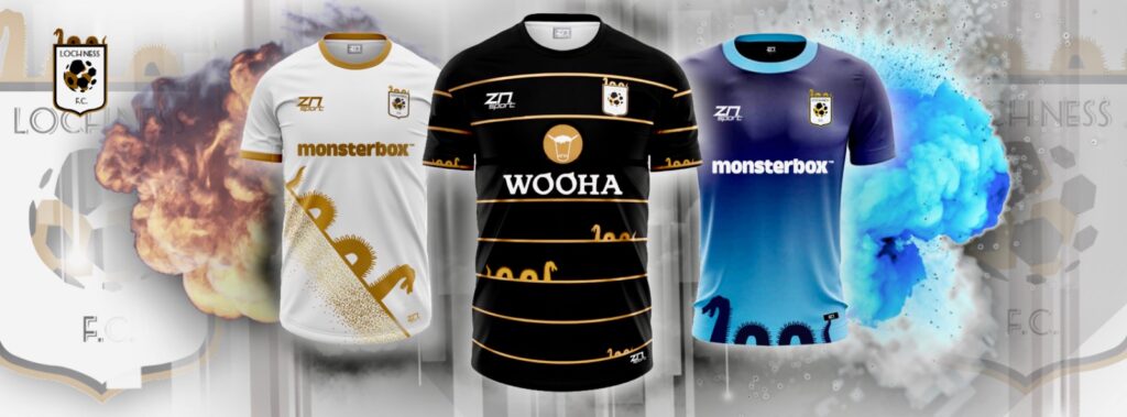
10/10
(AH), If only they would dispatch it.
The AhhGee Premier League 2020 Best Football Shirt of the Season:
(AH)
Home: Liverpool.
Away: Everton.
Third: Southampton.
(MB)
Home: Liverpool but Villa is a close 2nd place
Away: Leeds
Third: Crystal Palace or Southampton’s white River Plate one
(GD) Can i go home now?
(MB) Yes, once you’ve edited it together, sorted out my spelling mistakes and put the pictures in.